2022 Qtr. 3 Picture Story
Guest User
Betty Udesen, Benjamin Benschneider, Elaine Thompson, Quarter 3 Judges
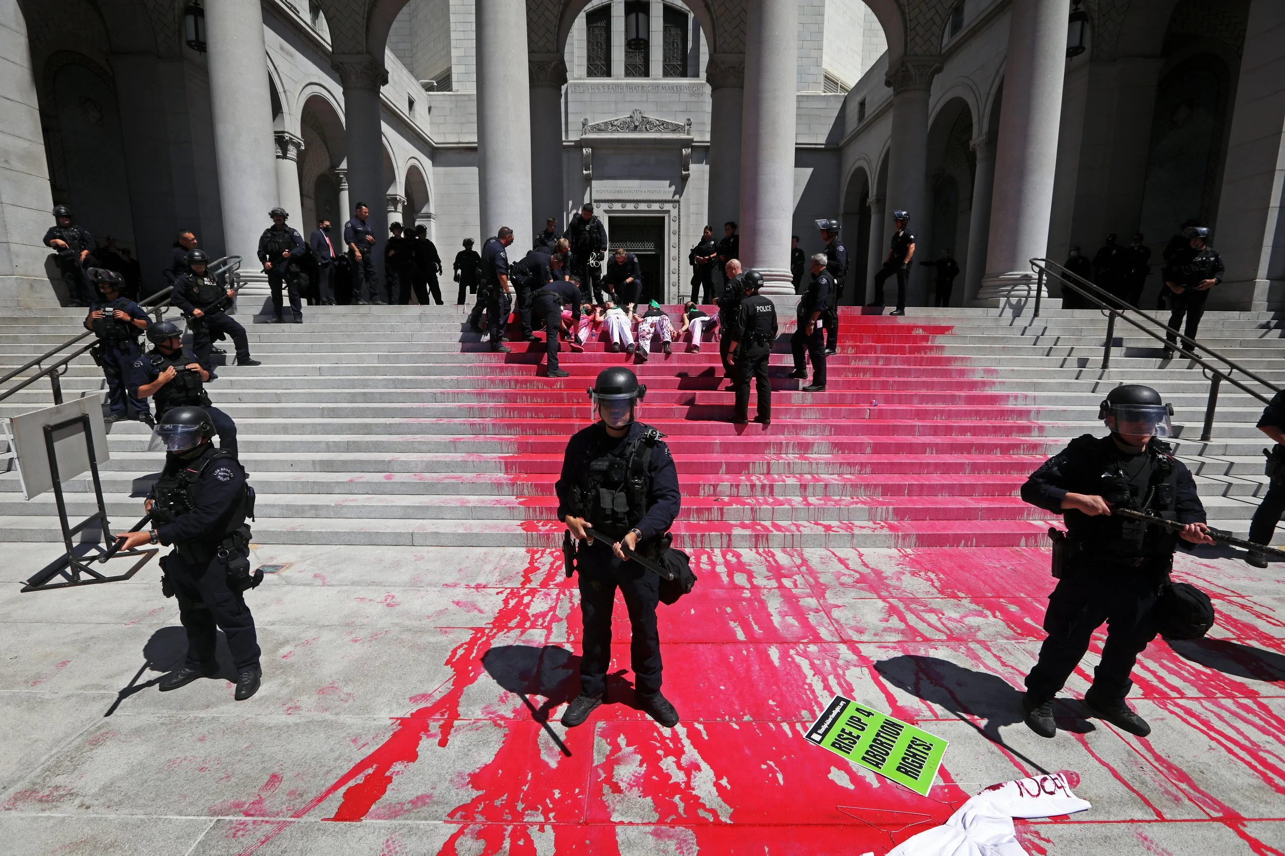
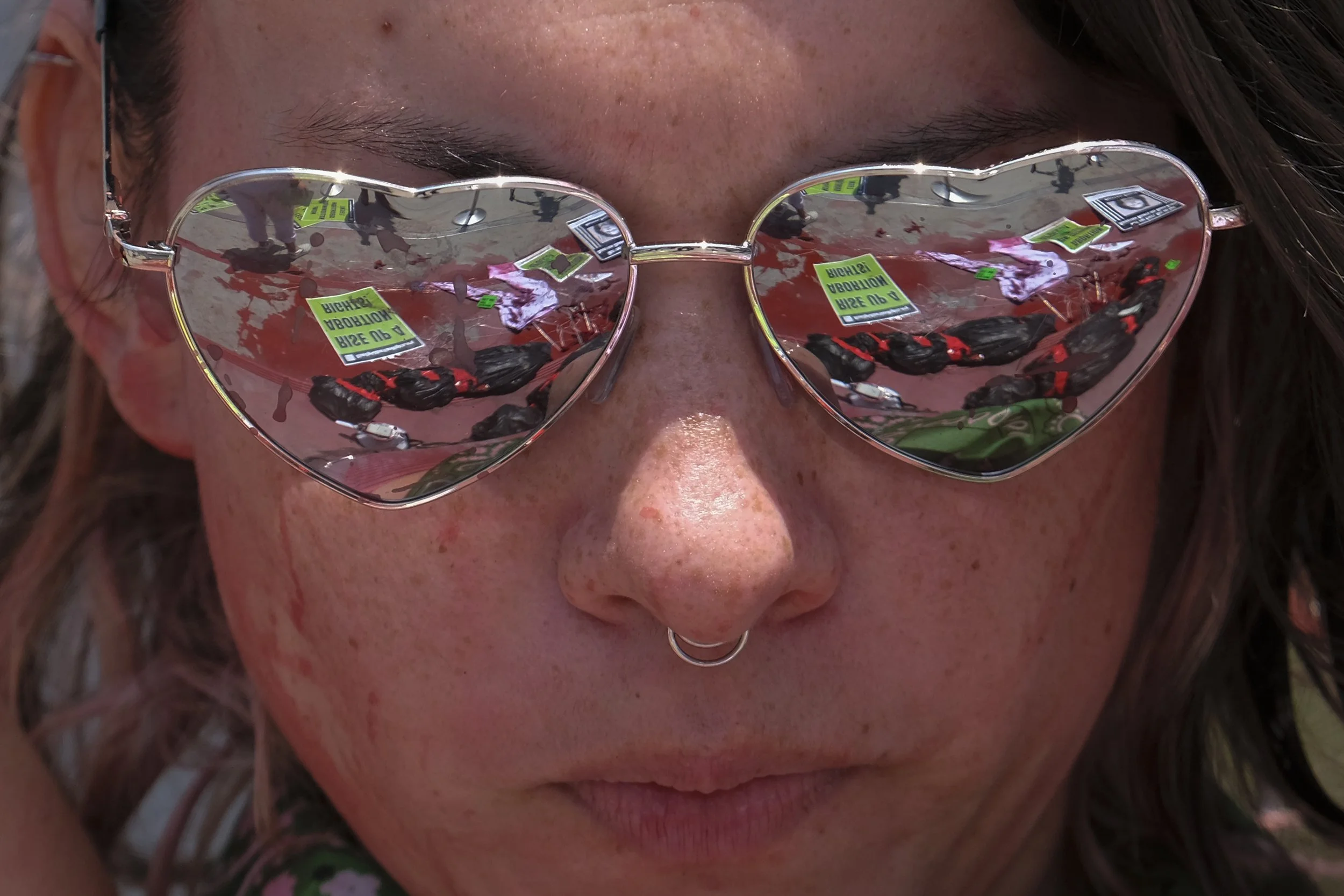
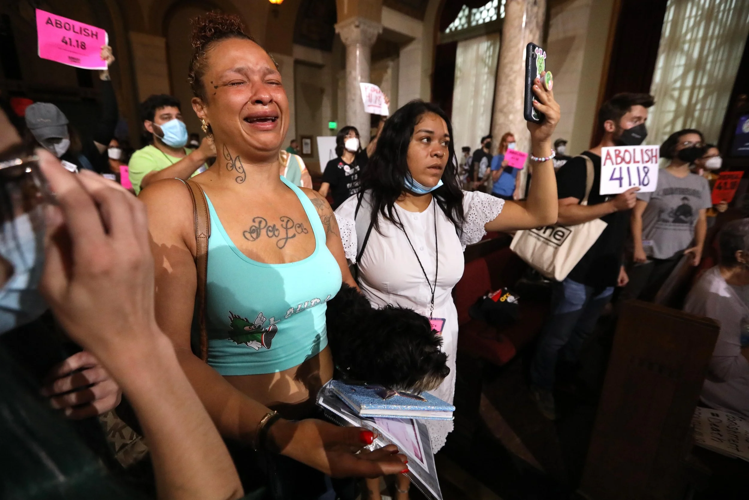
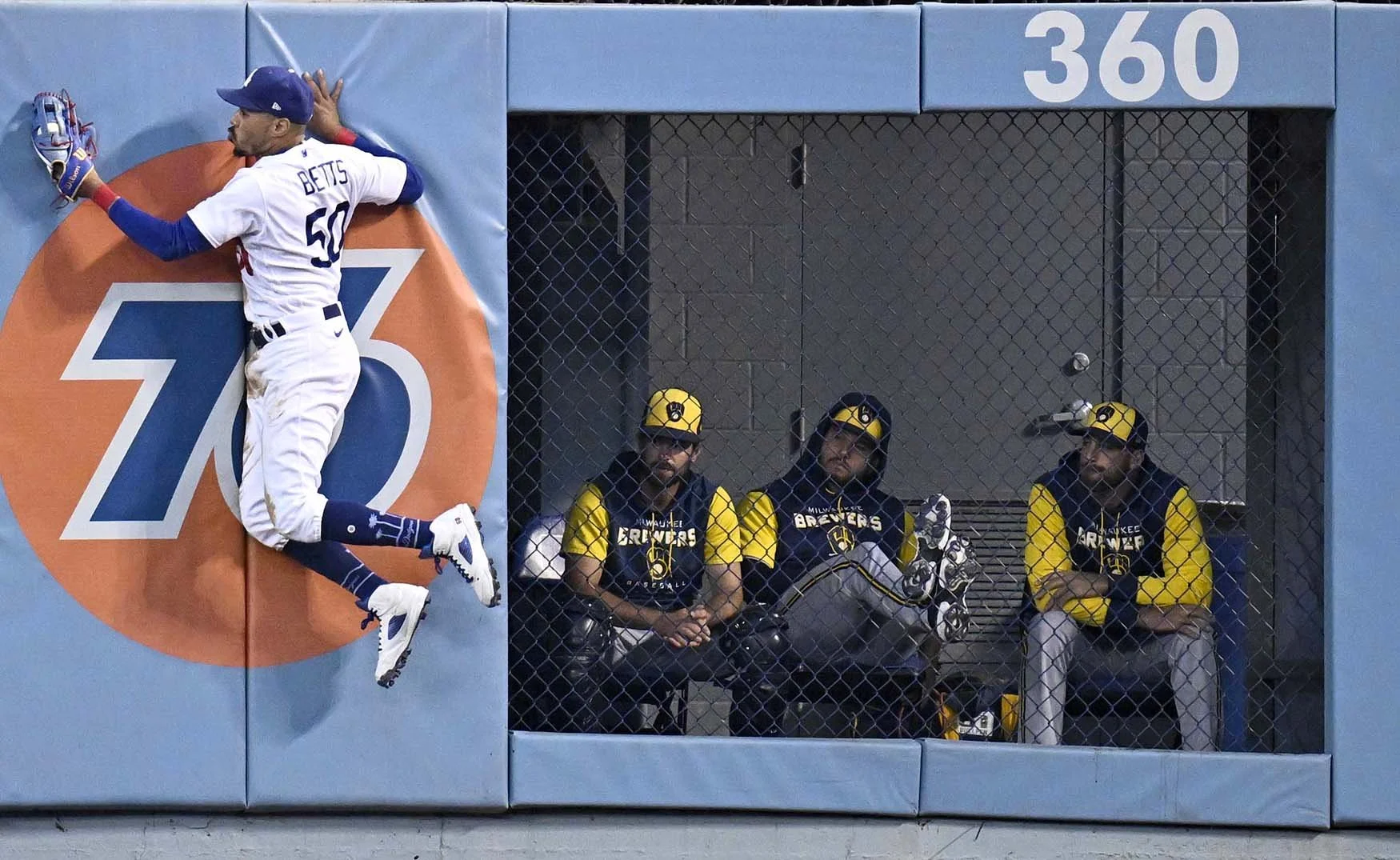
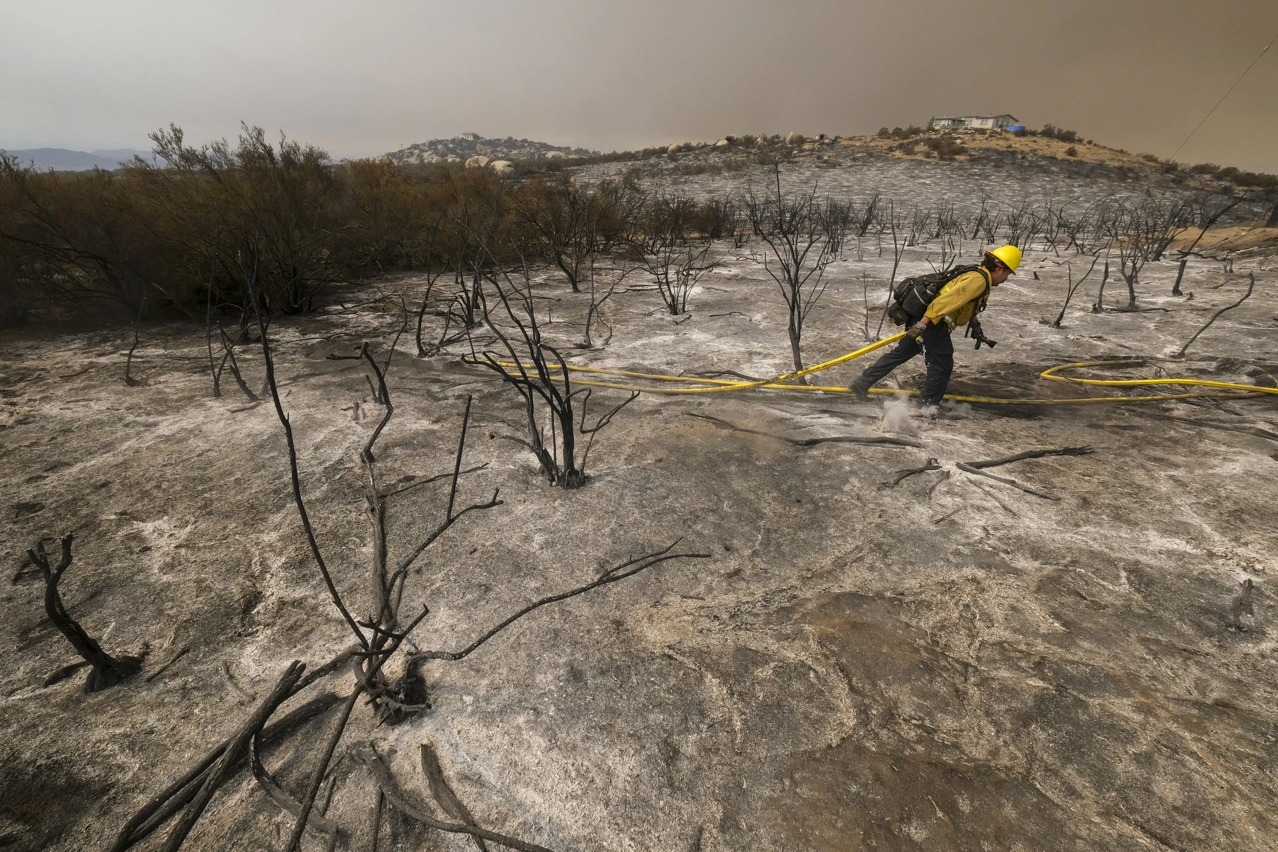
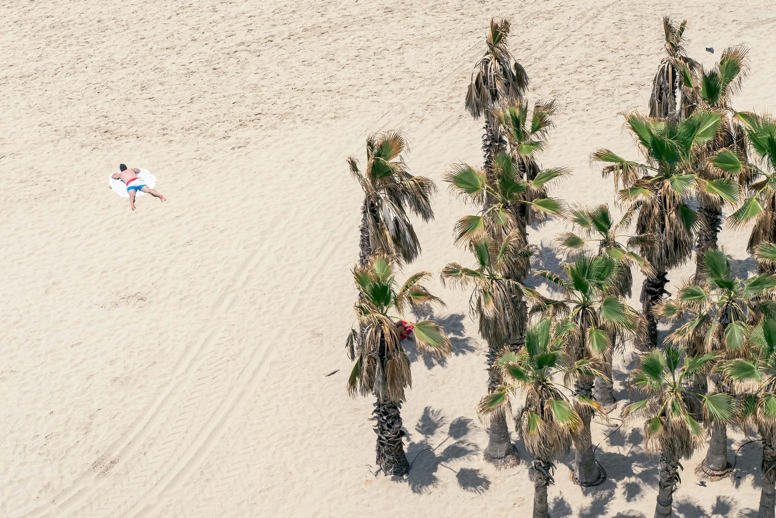
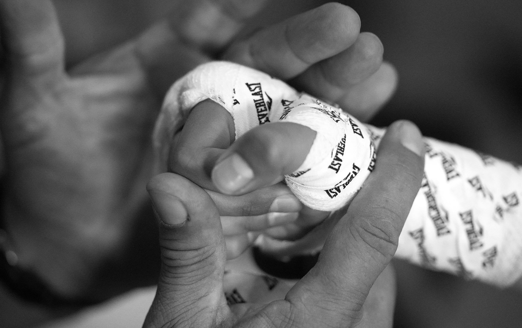
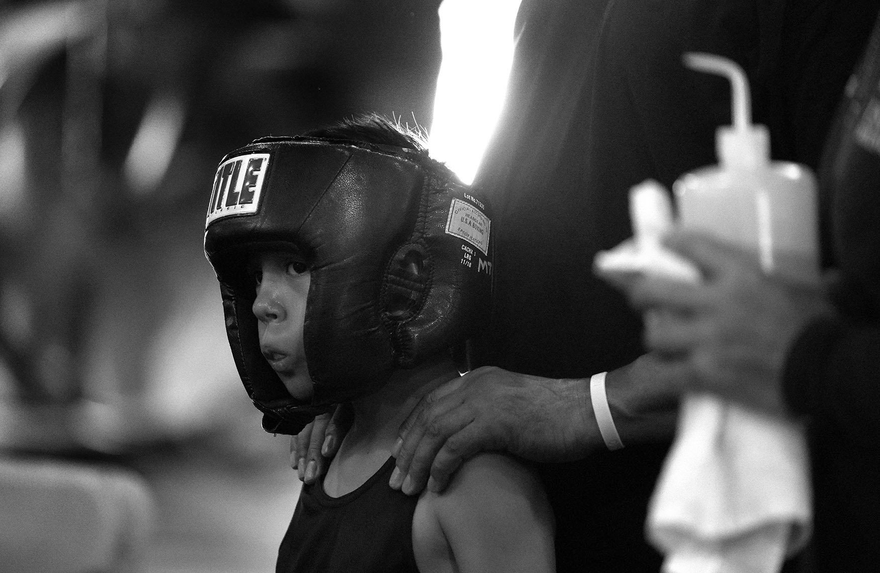
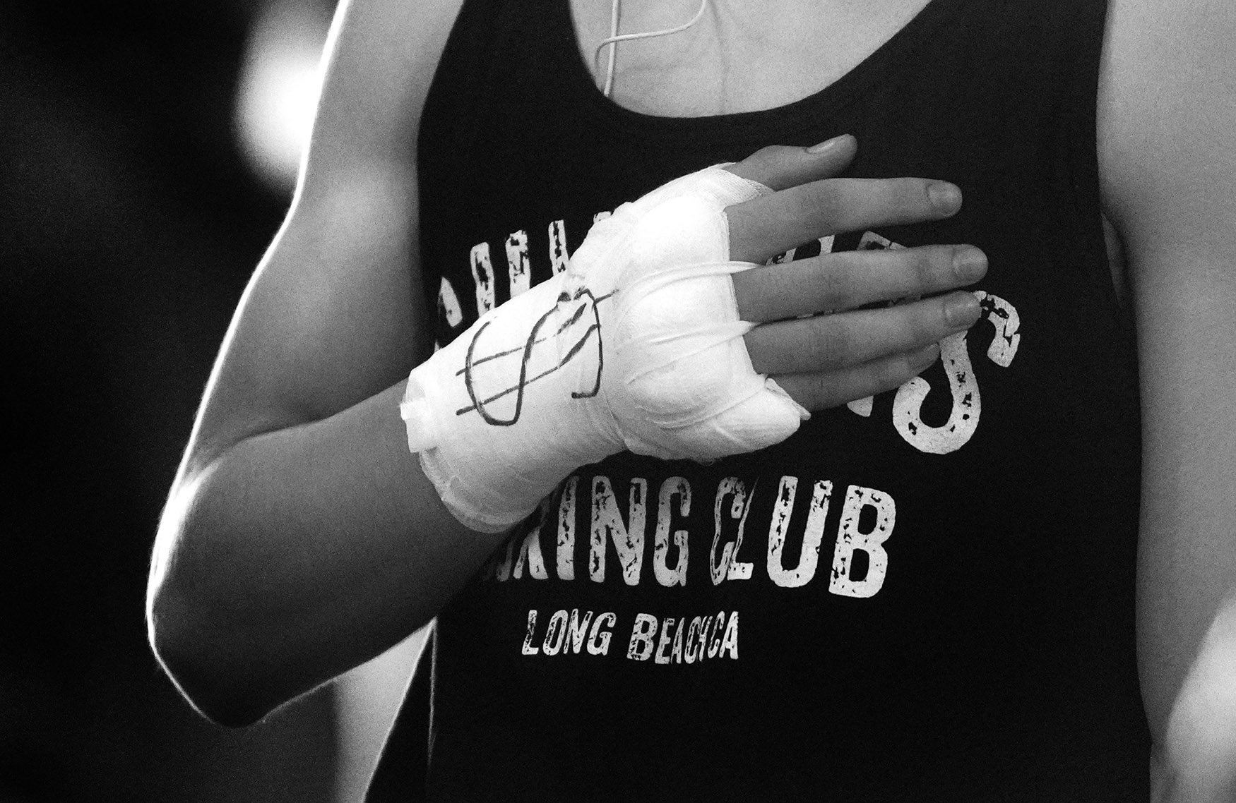
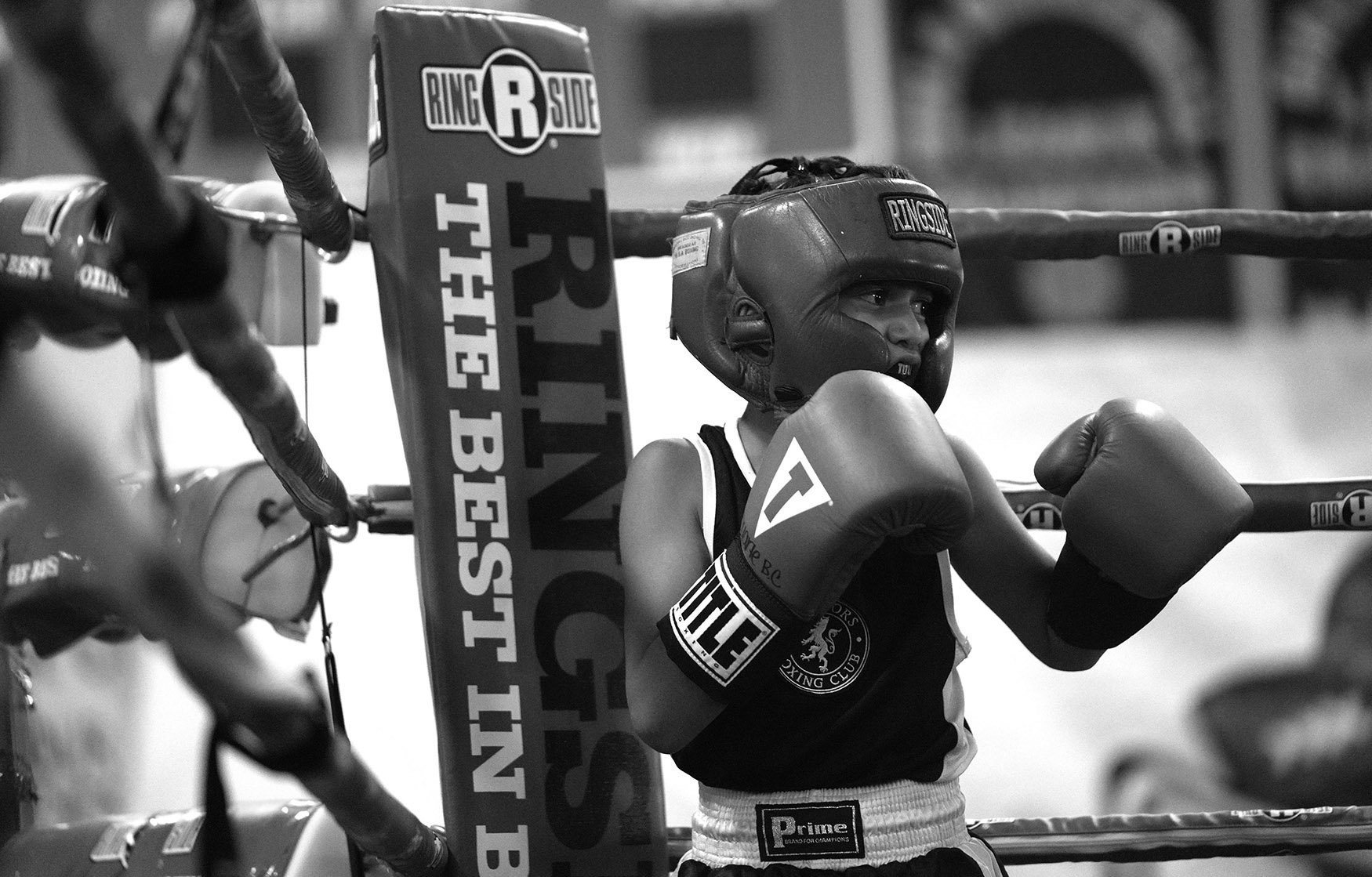
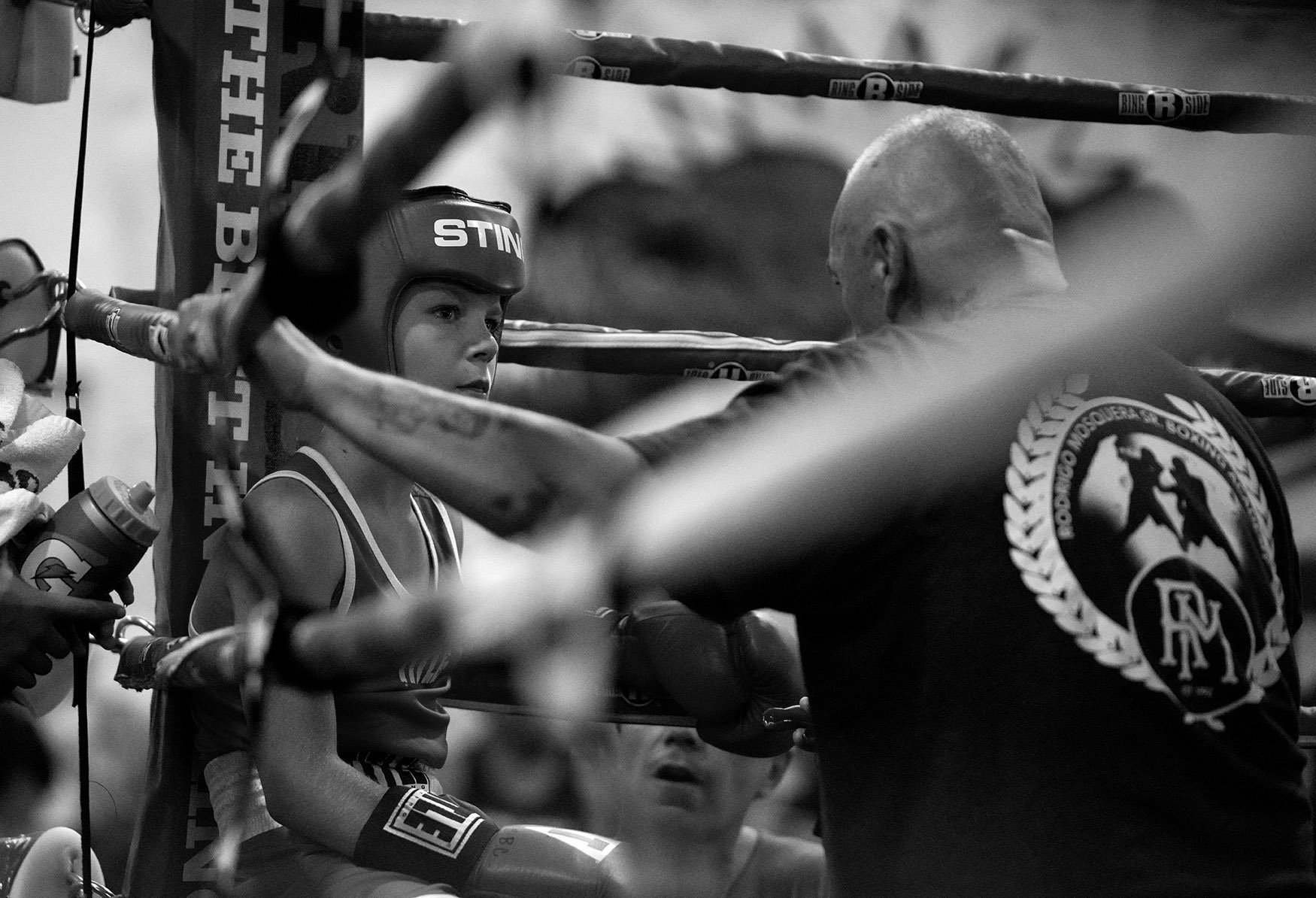
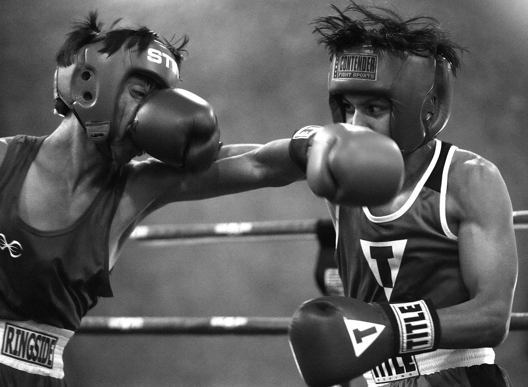
First Place: Keith Birmingham, Pasadena Star-News
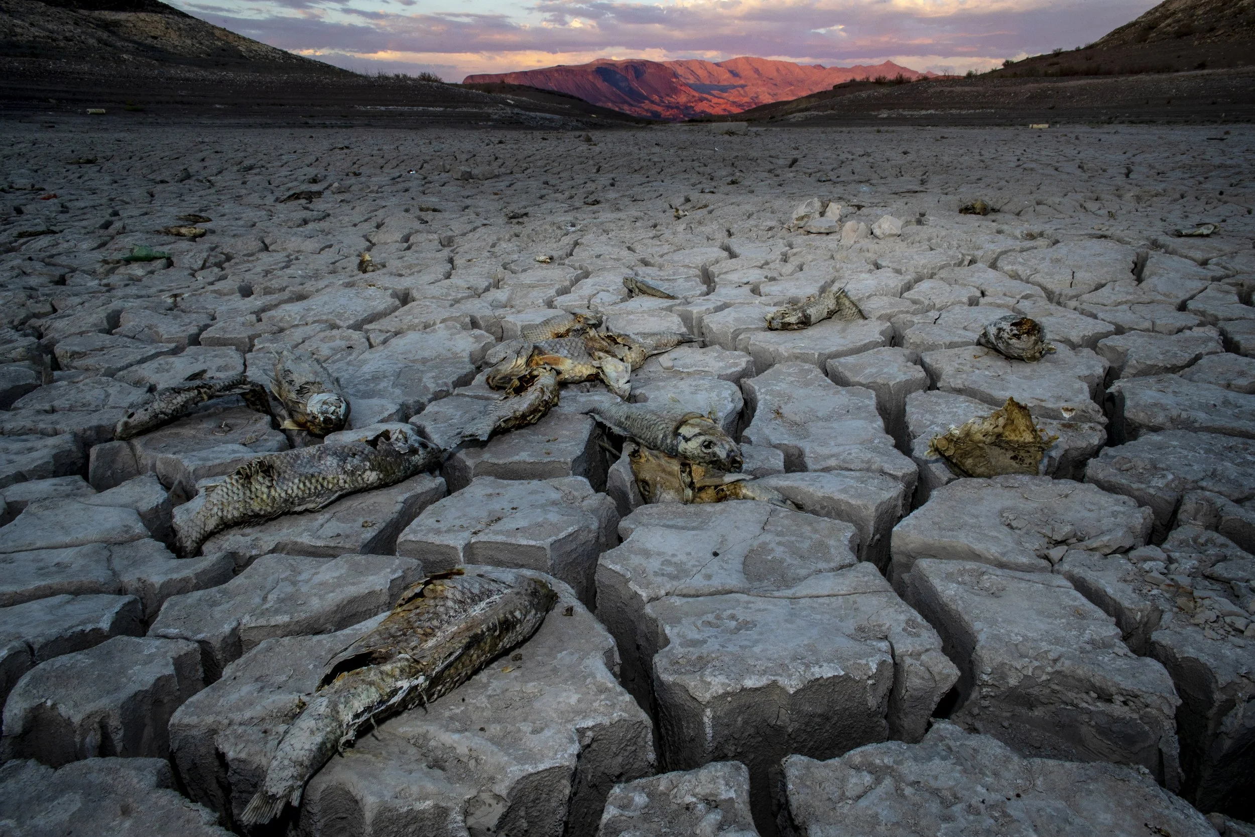
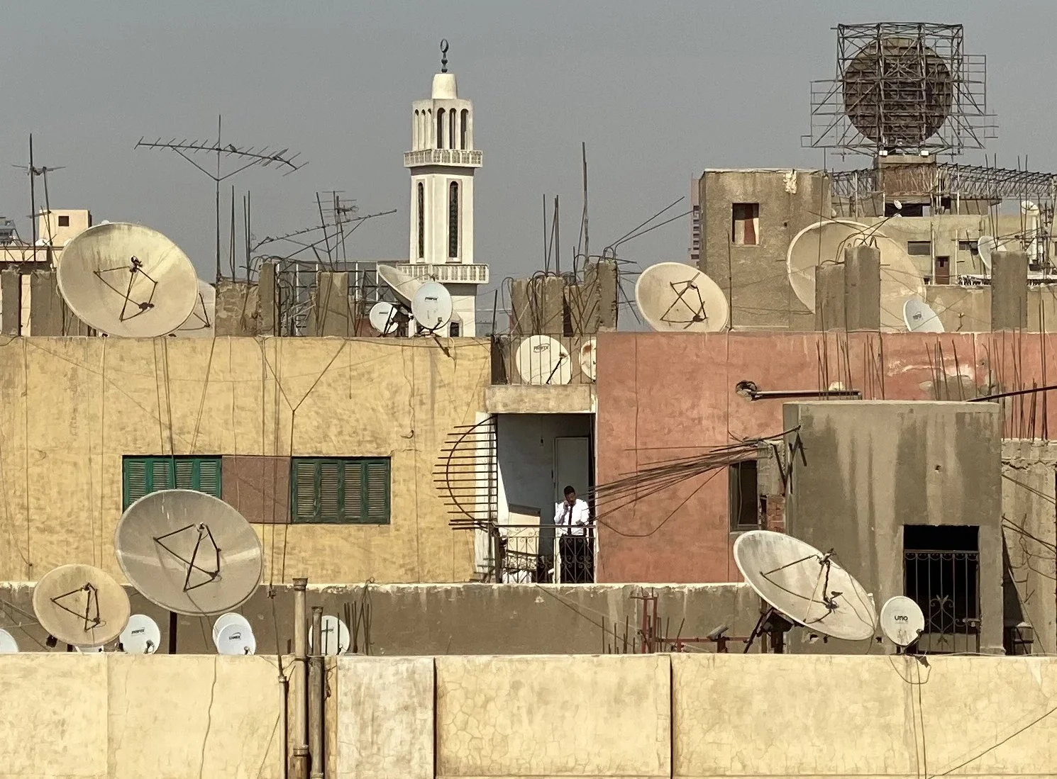
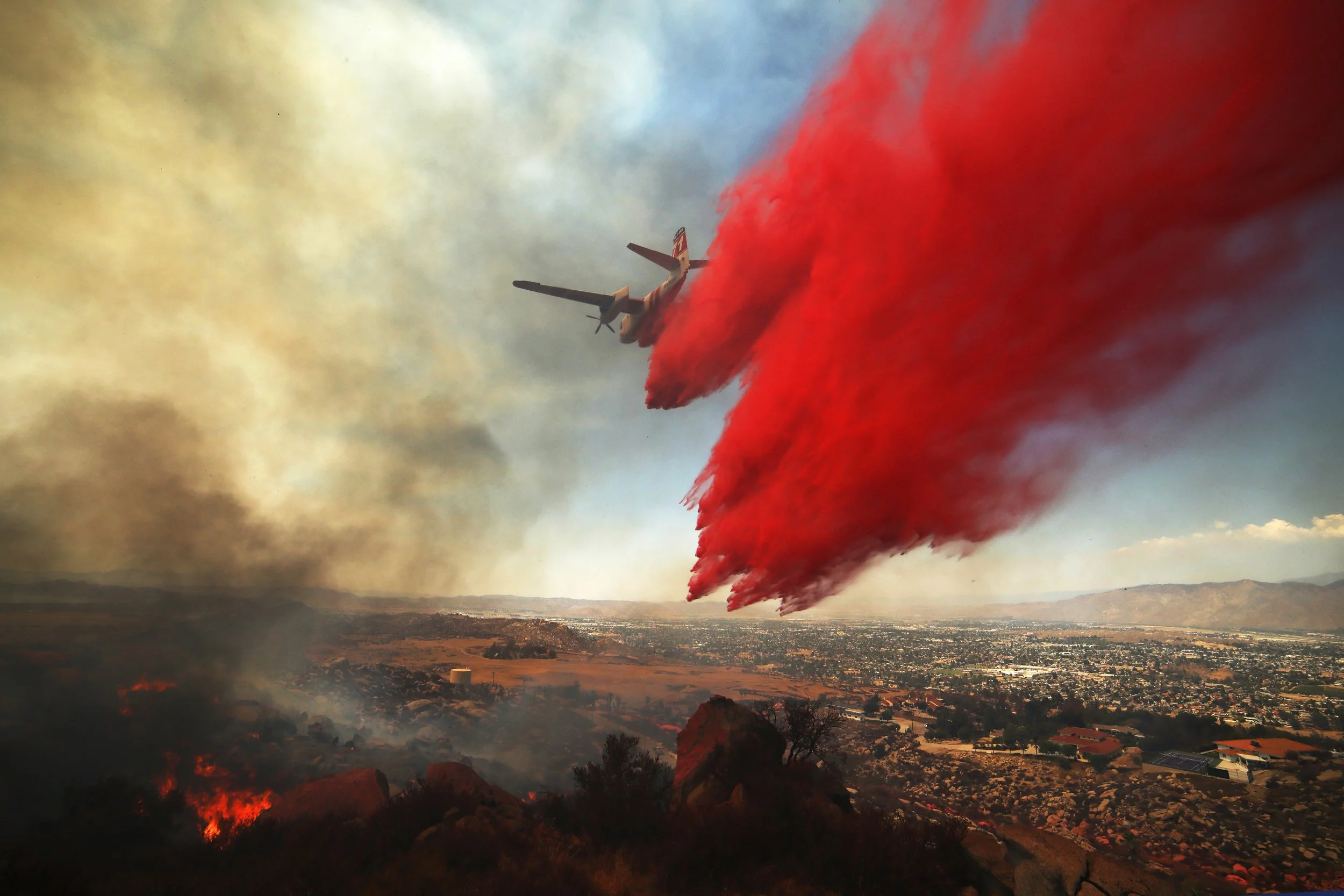
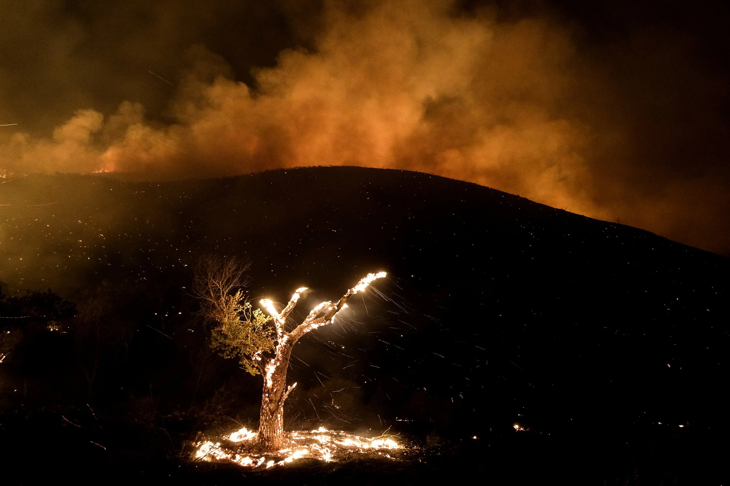
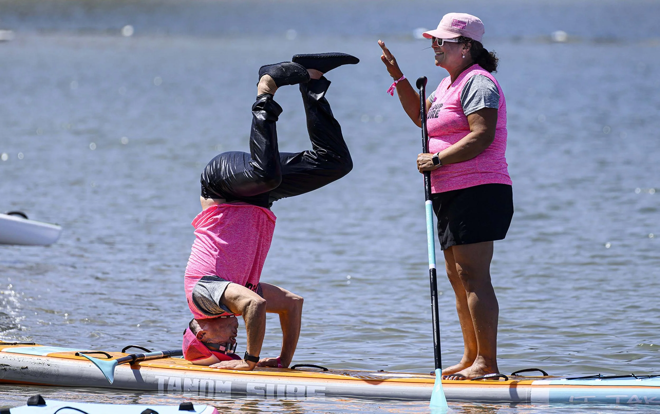
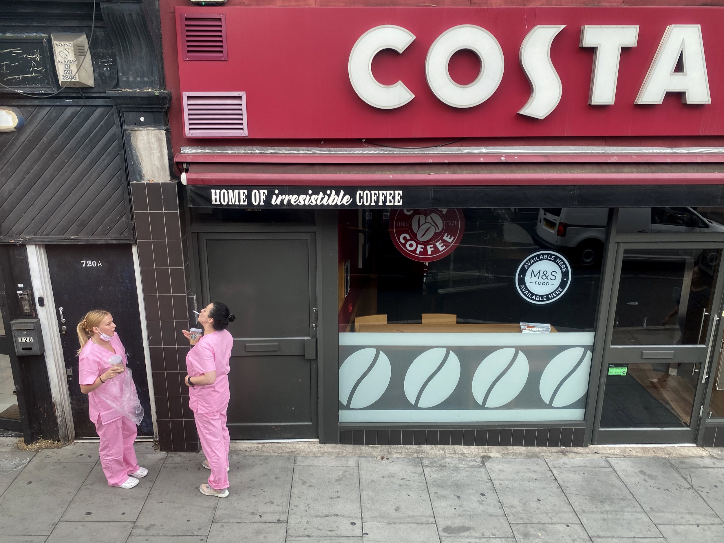
Second Place: Michael Nelson, Freelance
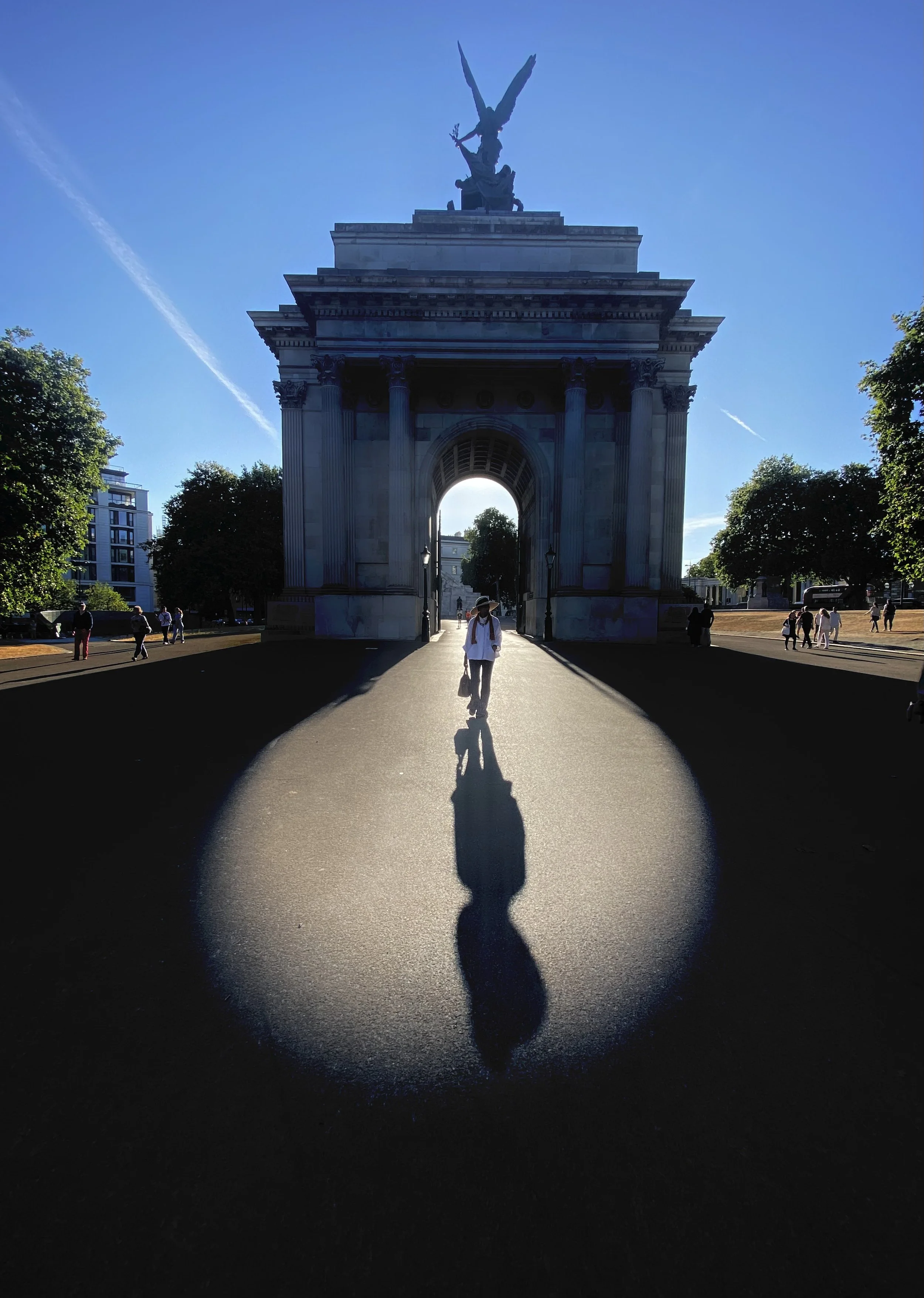
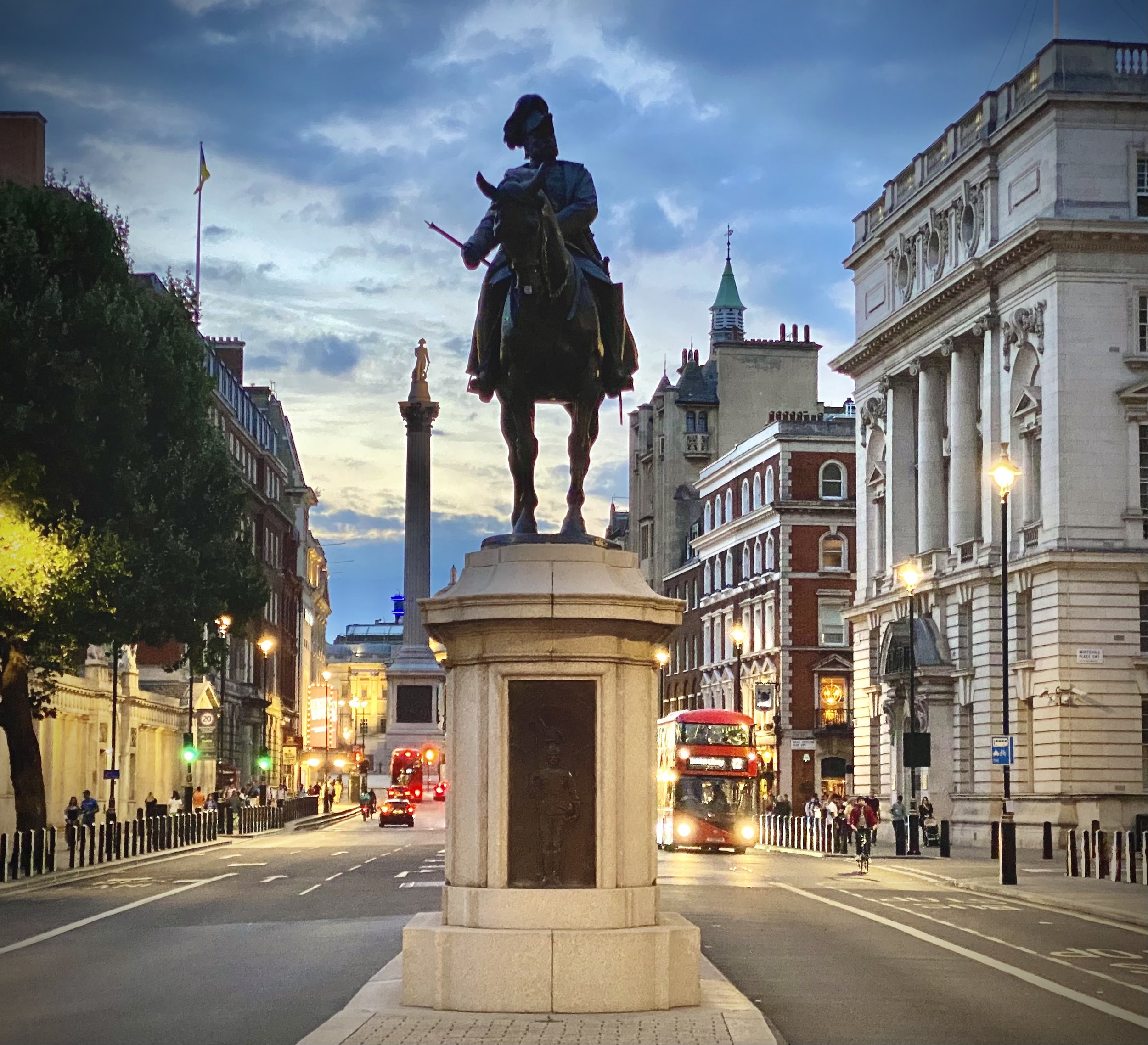
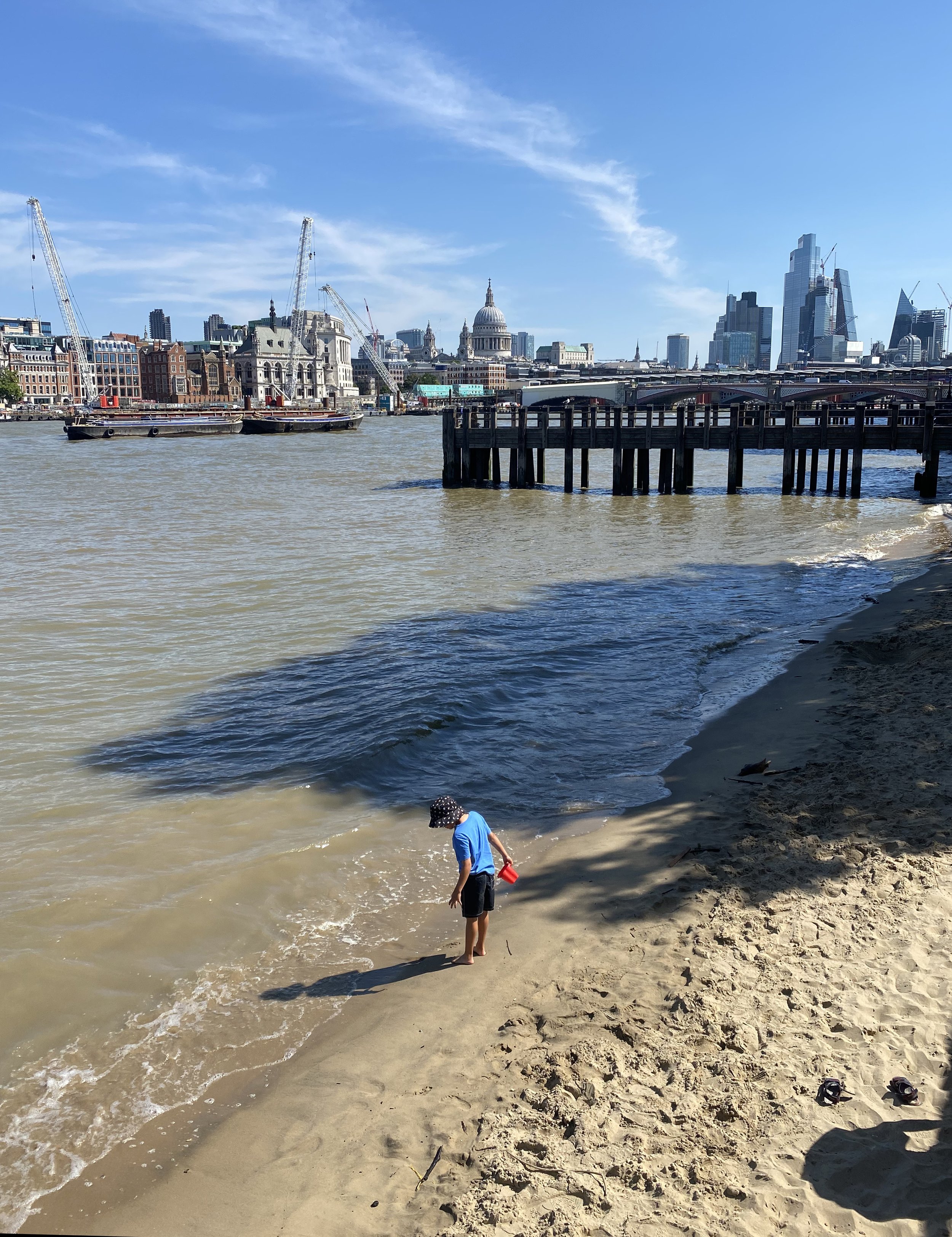
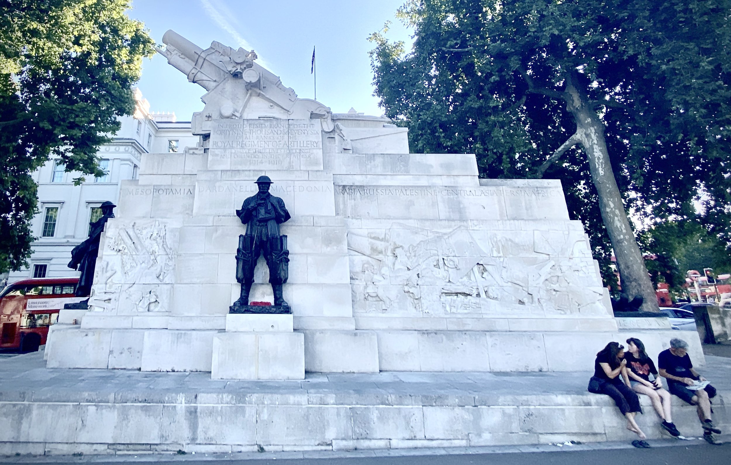
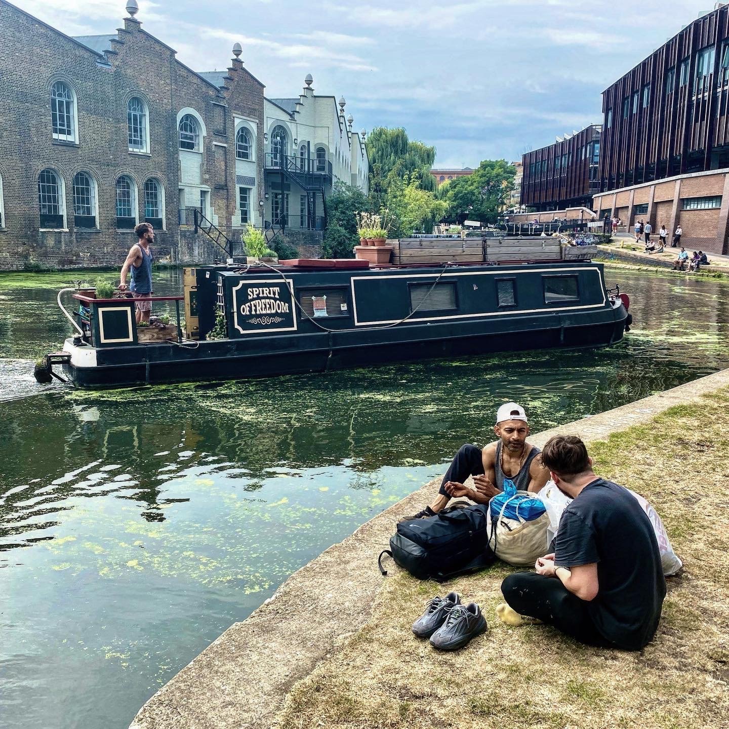
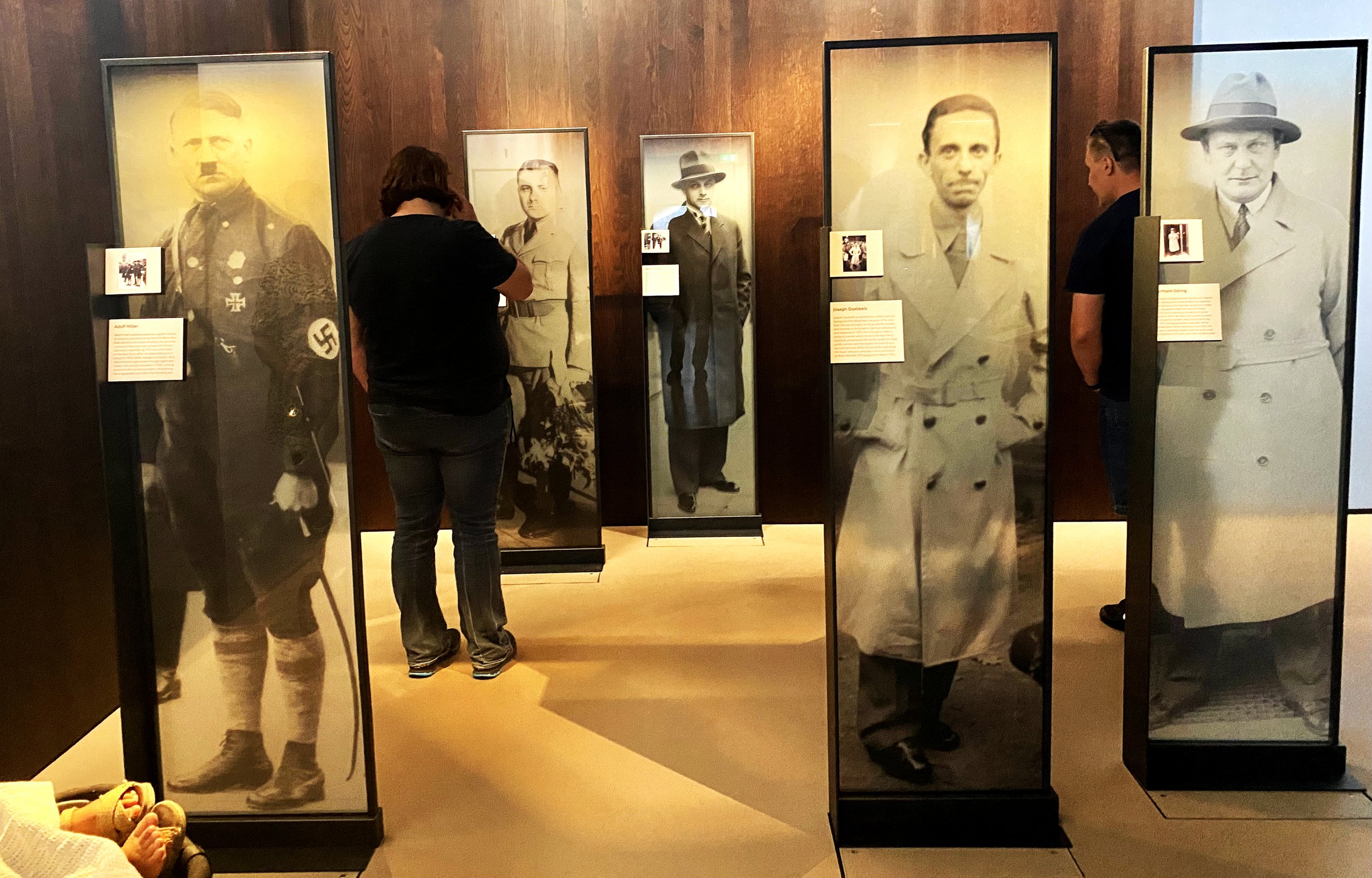
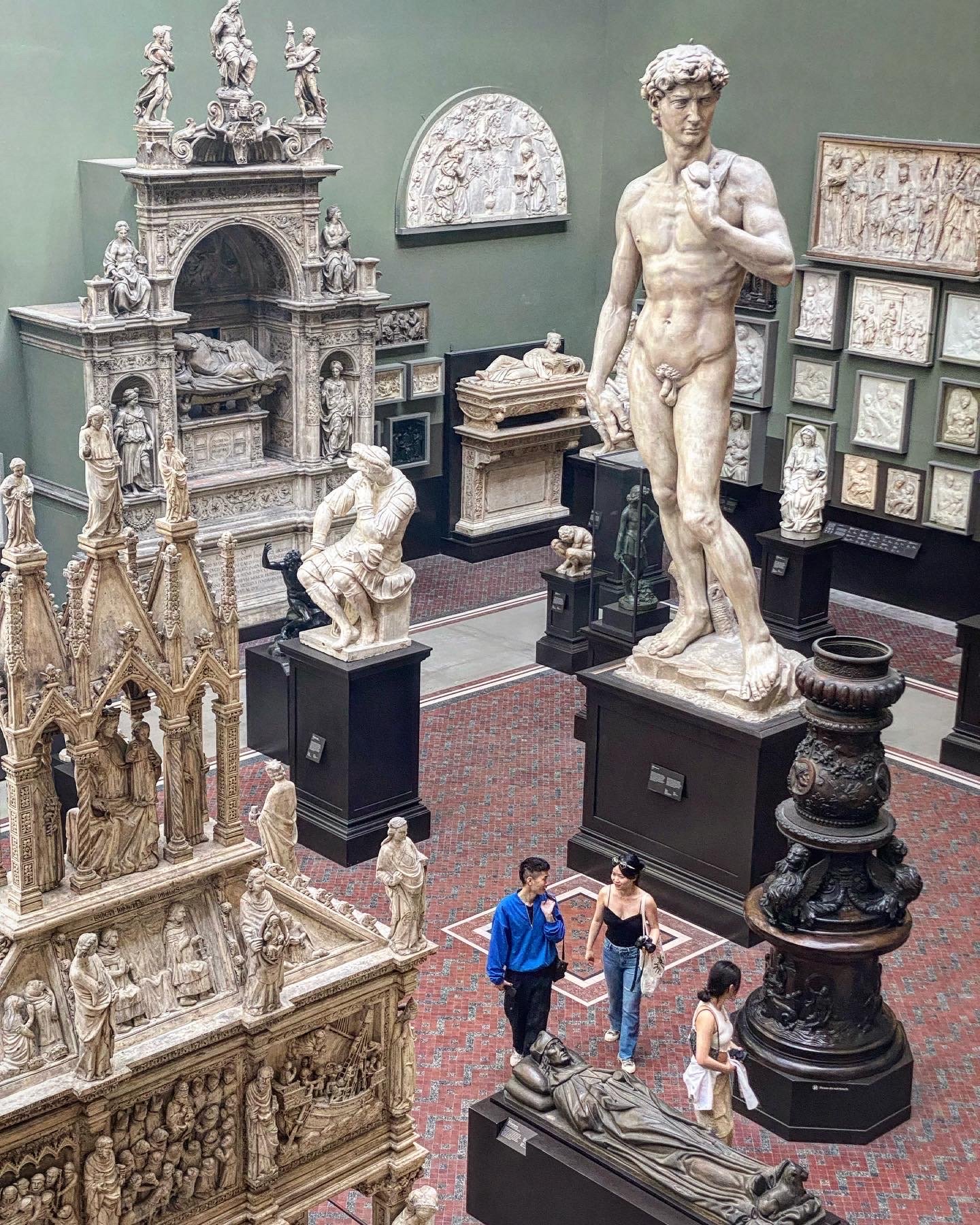
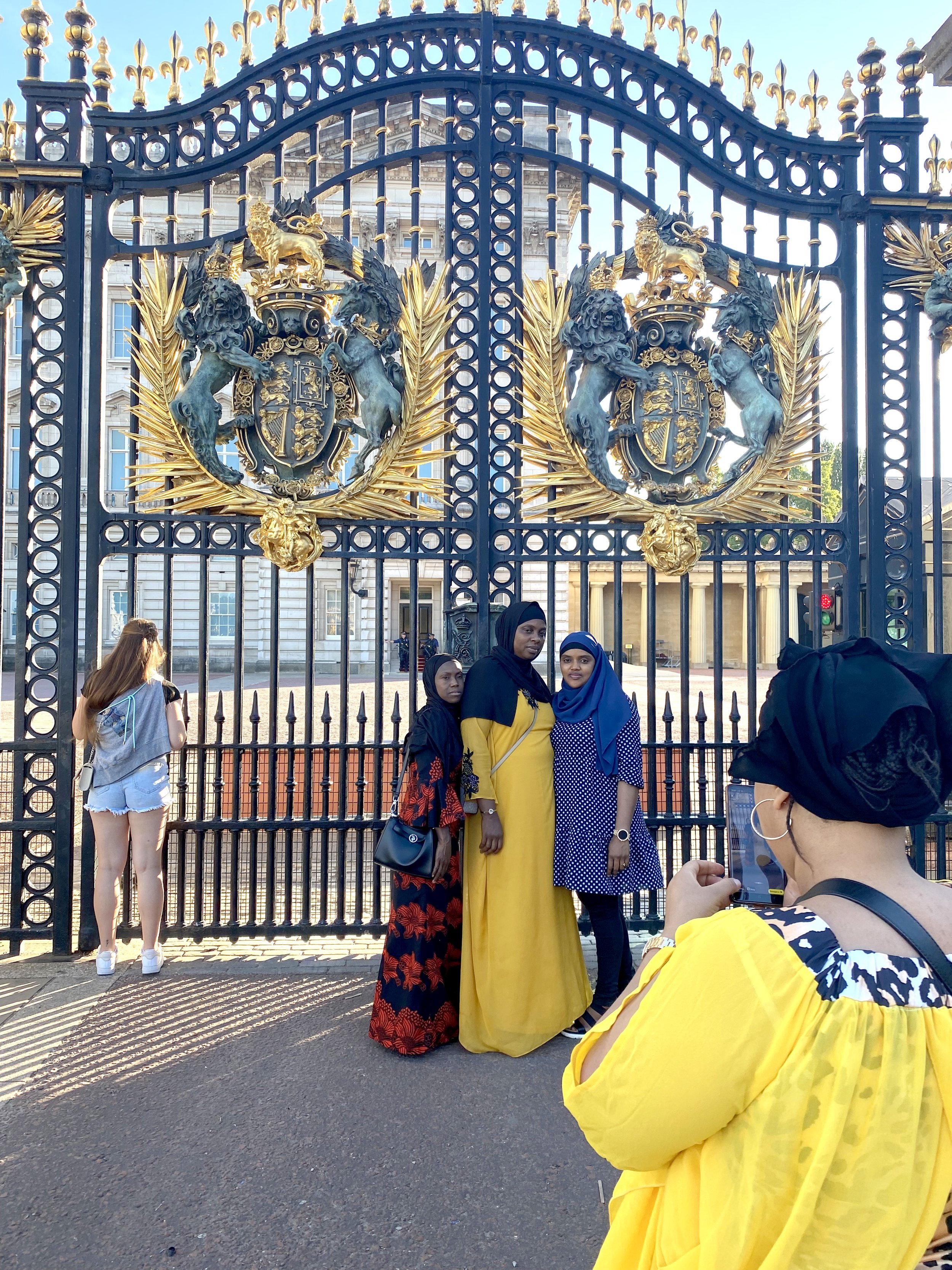
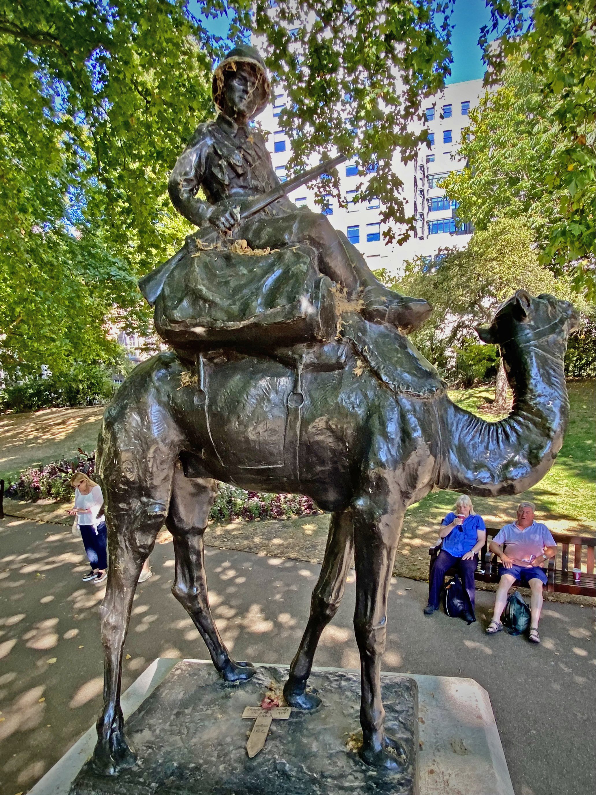
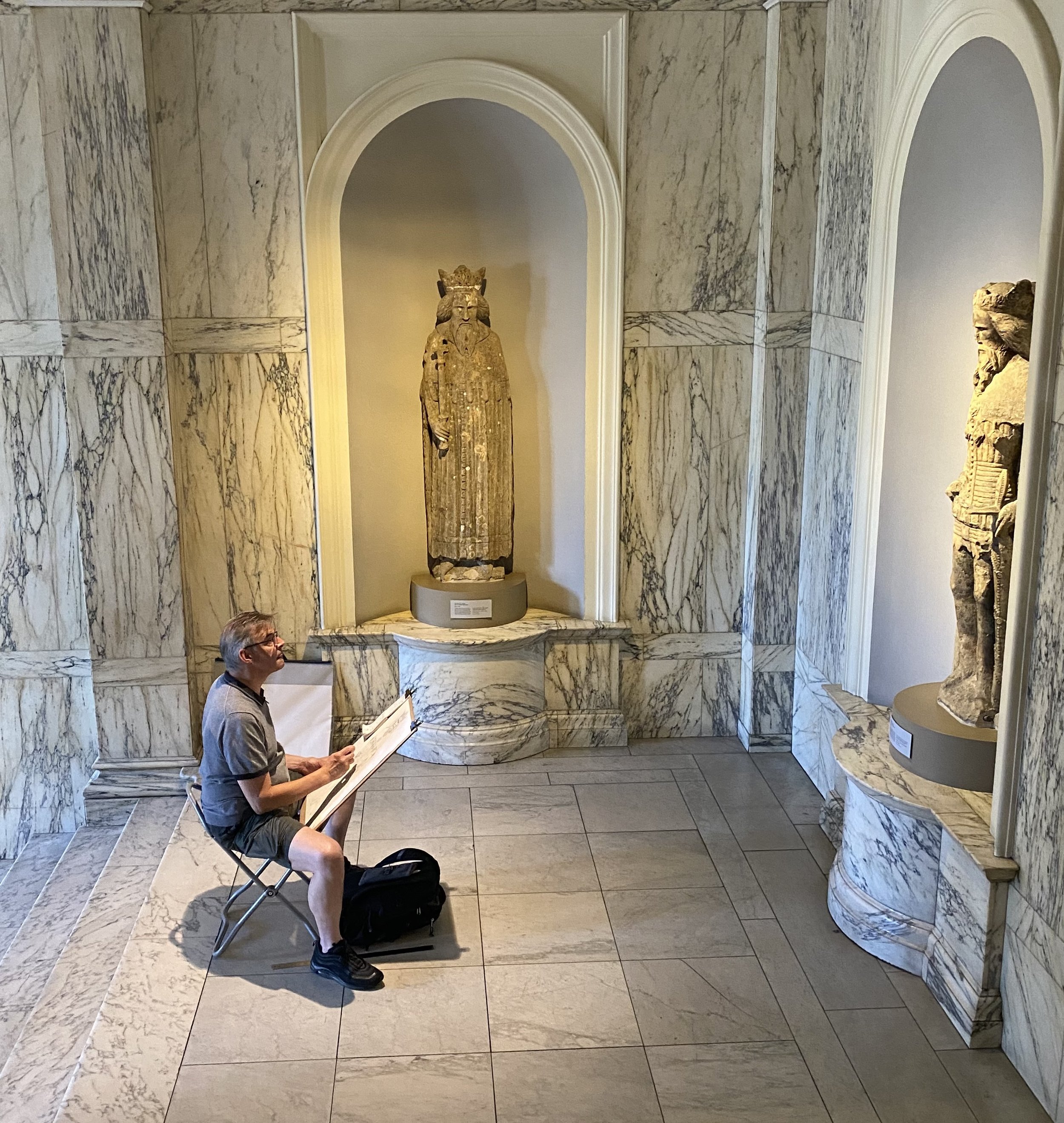
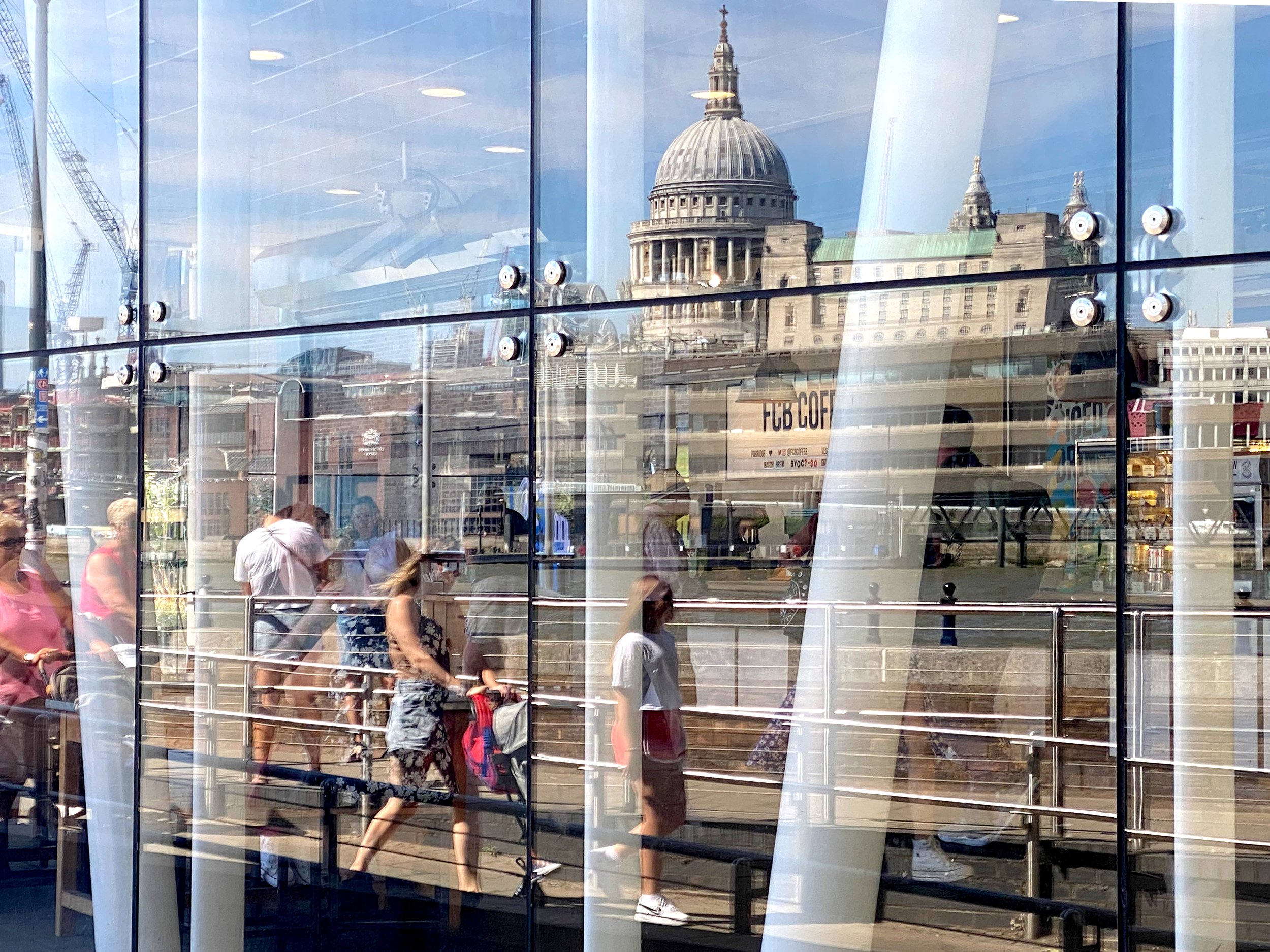
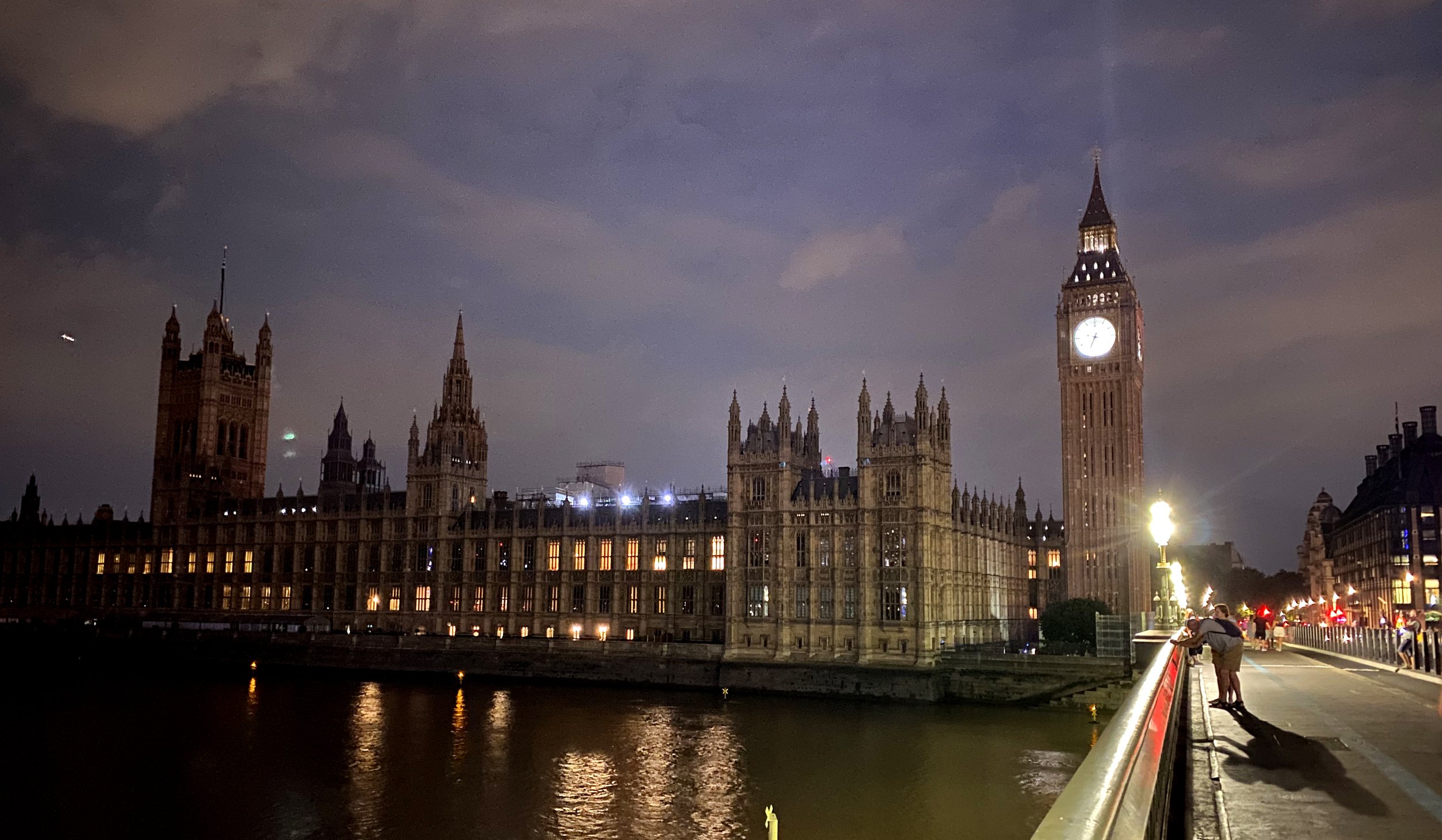
I was in London staying in my parent's flat in Whitehall Court. My dad passed away 30 years ago, my mother two years ago. They had lived in London and had bought a small place overlooking the Thames River. Each day I would set out to discover the city they so loved and thought about their lives together. This is the story of the London I became to love as well.
Meet Our Judges, Betty Udesen, Benjamin Benschneider, Elaine Thompson

Betty Udesen

Benjamin Benschneider

Elaine Thompson
Betty Udesen, a photojournalist, is best known for her ability to make compassionate, respectful photographs in delicate and complex situations. She was a pioneer in multimedia reporting that combines still images with field-recorded sounds and interviews. Working both for The Seattle Times and as an independent producer, her photography and multimedia projects, local and international, have been honored with numerous awards.
Benjamin Benschneider’s extensive career as a photojournalist with The Seattle Times has given him the opportunity to travel throughout the United States, Asia and Europe on assignment. He melded his sense of composition, acute technical skill, and artistic expression to create photographic essays on a wide variety of subjects. Through Ben’s passion for design and his expertise in architectural photography, Ben conveys architecture’s best to a wide audience of professional and public observers. His work is regularly showcased in many architectural books and magazines.
Elaine Thompson recently retired from a 26-year career as a Seattle-based photojournalist for the Associated Press. Over the course of her AP career, she covered everything from high-level sports assignments, including five Olympics and one World Cup, to spot news, the big regional businesses of Boeing, Starbucks and Amazon, orca whales in the Salish Sea and fish tossing at the Pike Place Market. She is best known for a photo she took her first week on the job in Seattle in 1995, when Mariners' Ken Griffey Jr. smiled from beneath a celebratory pig pile after the team beat the Yankees in a playoff series, and for shooting the removal of a nest of so-called "murder hornets" in Northwest Washington near the Canadian border in 2021.